Wezuro
New cash back product
Wezuro design
Wezuro is a newly designed cash back shopping product in 2023. As a product designer, I was involved from inception to completion. I proposed the initial direction naming to crafting the entire product, encompassing app design branding, overall service design, motion, app introduction page, interaction, and aspects of QA.
Timeline
Jan 2023 - Aug 2023
My Role
Product design
Design system
Motion/Interaction
Branding/Visual
Scroll to Final
Design process

Explore Asia

MAIN

vietnam

laos

Your next story begins with your next vacation

Tene & Lisi

45 Min

Design process
Background
Can an unfamiliar term 'via shopping' be established as a product?
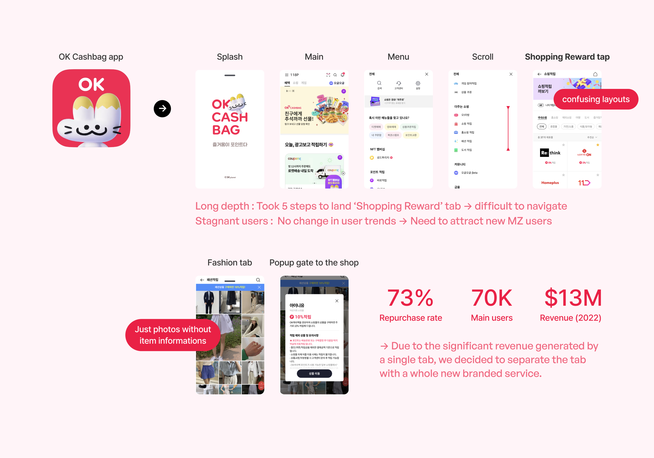
OK Cashbag, the largest point product in Korea with 2.1 million users, offered various features.In early 2023, there was a mission to successfully separate the 'Shopping Rewards' tab and create it as a standalone app. The 'Shopping Rewards' tab features a function where, when a product is purchased through the provided link, points are received as cashback. However, due to the large scale of the service, the depth to reach the tab was long, and with the main users being in their 30s and 40s, it was necessary to separate the service to attract a younger, MZ generation of users.

Highlights

Friendly Guide

Designed animated graphics for first-time users

vietnam

Splash to Main

Build seamless flow for main page landing

laos

Intriging Challenge

Created challenge pages to lock in users

Wezuro
New cash back product
Wezuro design
Wezuro is a newly designed cash back shopping product in 2023. As a product designer, I was involved from inception to completion. I proposed the initial direction naming to crafting the entire product, encompassing app design branding, overall service design, motion, app introduction page, interaction, and aspects of QA.
Timeline
Jan 2023 - Aug 2023
My Role
Product design
Design system
Motion/Interaction
Branding/Visual
Scroll to Final

Explore Asia

MAIN

vietnam

laos

Your next story begins with your next vacation

Tene & Lisi

45 Min

Tene & Lisi

1 week

Tene & Lisi

1 Month

Background
Mission: Separate a feature from a product into its own app.
OK Cashbag, the largest point app in Korea with 2.1 million users, had a mission: to separate the 'Shopping Reward' tab and create it as a standalone app. The tab features a function where points are received as cashback when a product is purchased through the provided link. Due to the product's large scale, accessing the tab required navigating through many layers. Also the main users were in their 30s and 40s, separating the service was essential to attract younger MZ generation users.
But how can we separate a feature
if they share same point value?
Defining problems
Can I convey complex concepts and the necessity of creating this product?
The product team’s mission was to develop a new cash back shopping service, distinct from ‘OK Cashbag,’ while facing the challenge of using the same point system. Despite the identical service logic, it was essential to create a unique atmosphere and offer different benefits to effectively attract new customers.
Set goals
A compact and delightful product with profitable joy.
After having meetings with stakeholders, product design team set a project goal for the product to narrow down to research and design. The project goal was not just a goal unique to UX but was set in agreement with the overall direction of the service and relevant affiliated organizations, so its scope was not relatively narrow.
Research
Through analysis of main users and features,
I defined the directionin which the service should proceed in the future.
Target user
From Gen Z to young professionals.
To appeal to a younger audience than OK Cashbag's mainly 40s user base, we interviewed 7 people in their 20s and 30s. Most were either unaware of OK Cashbag or had only heard of it. By studying their spending habits, app use, and daily routines, we identified key commonalities.
User needs
After defining the target users, I set main user needs based on their pain points.
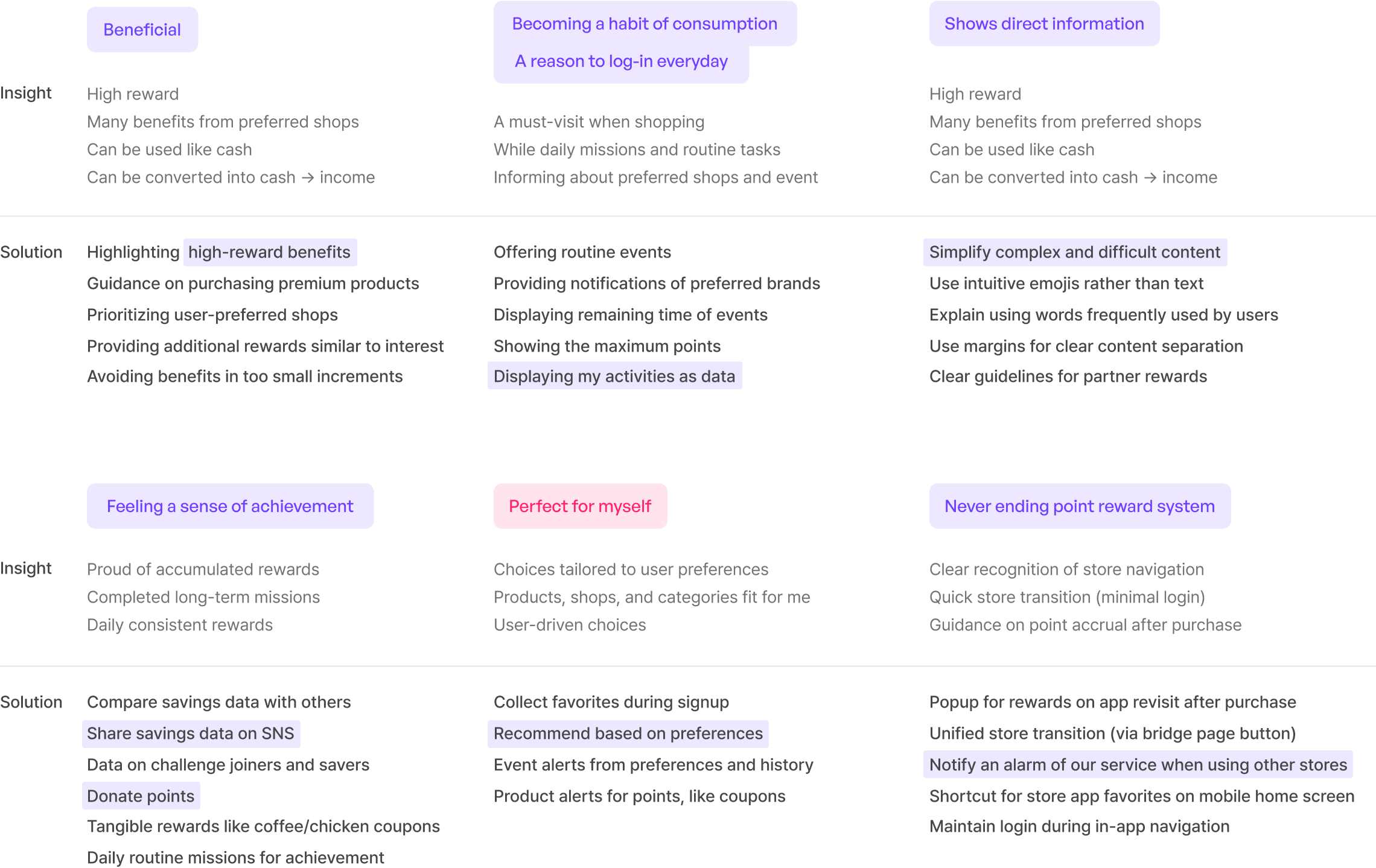
Keyword
I condensed user needs into 7 keywords, guiding our future solutions and insights.
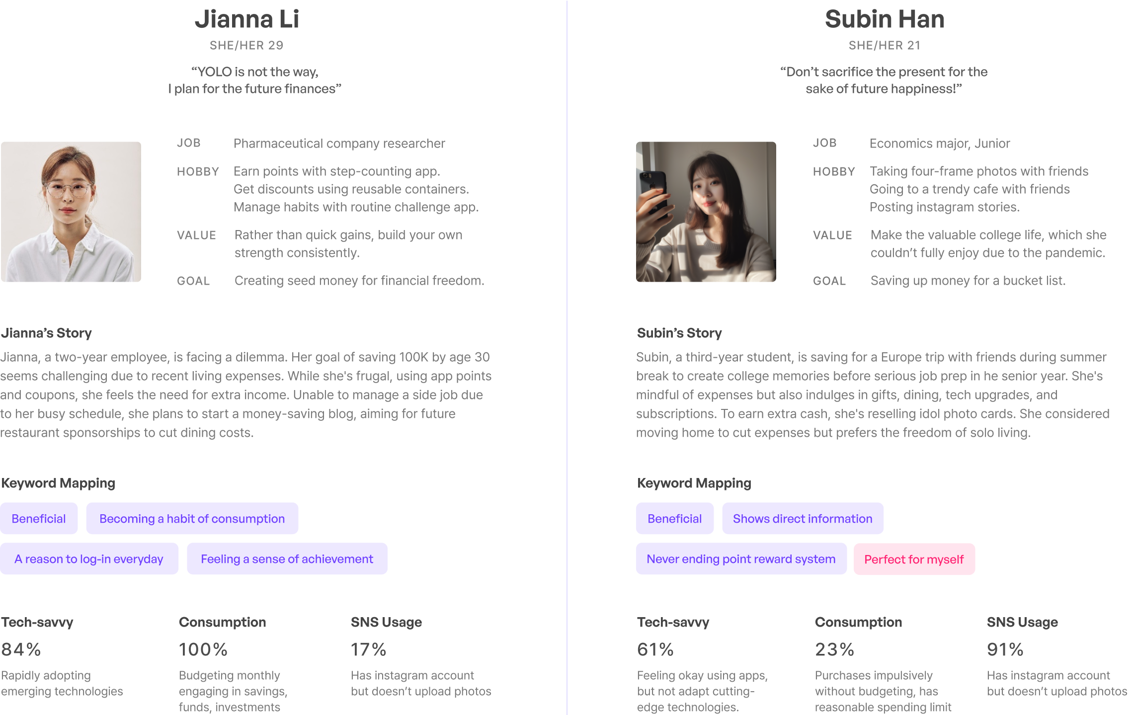
Persona
Based on specific keywords, I created the main persona Jianna
and the sub persona, Subin. Then outlined their behaviors briefly.
User Scenario
I anticipated the user scenarios of the personas and drafted them for various cases.
Benchmark
Before starting the design, I organized design benchmarks and trend reports by keywords to clarify the future direction.
Design proposal
During finalizing the direction, design team presented two proposals with hi-fi prototype based on the user research, and the style I suggested was selected.
GUI rules
I established the direction and rules to be followed within the design system.
Step-by-step
Due to the limited open hours, I divided the functions by phases
and identified the areas that currently need focus.
Main page
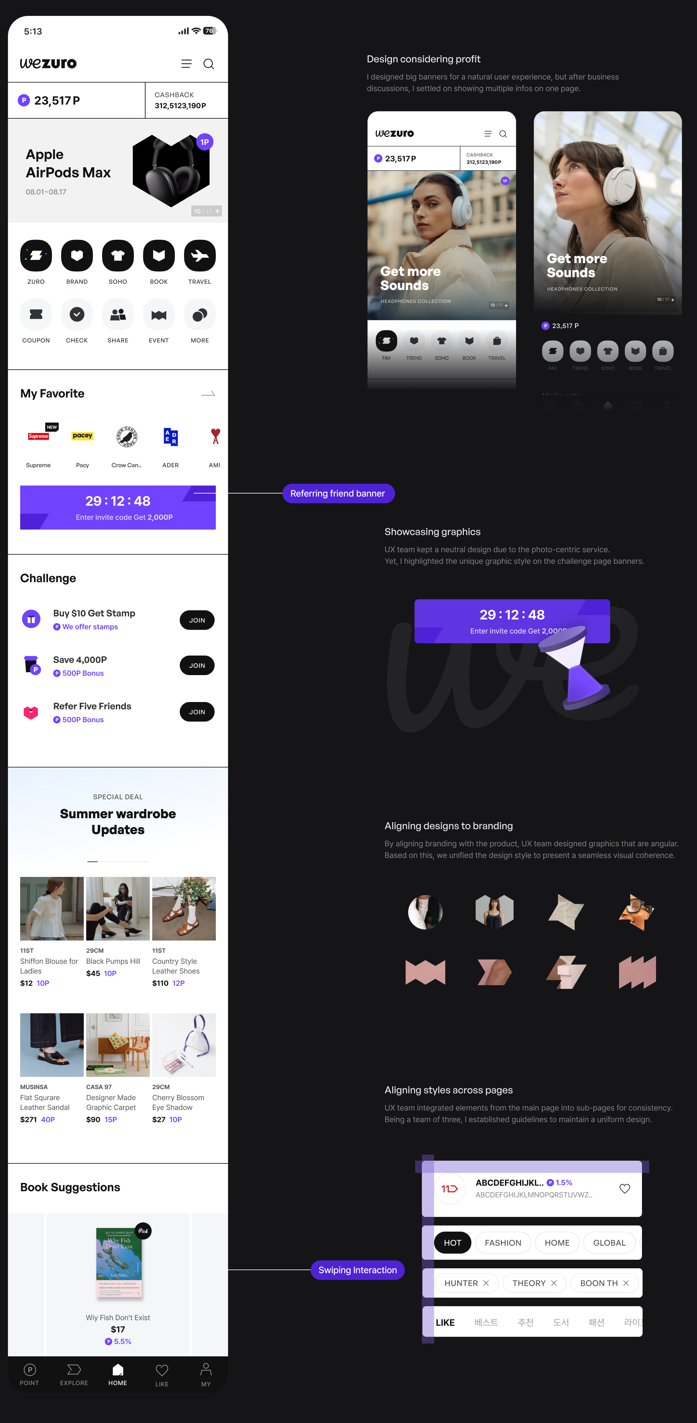
The main design uses neutral colors due to the exposure of numerous affiliated stores. I suggested the billboard-style line at the top, and created banner style to simplify ads.
Information
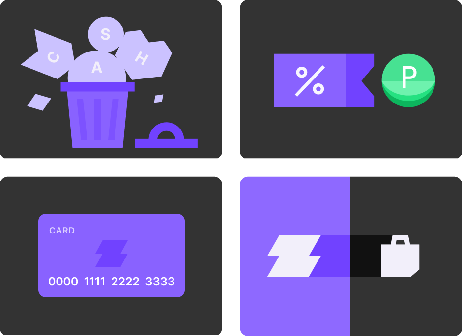
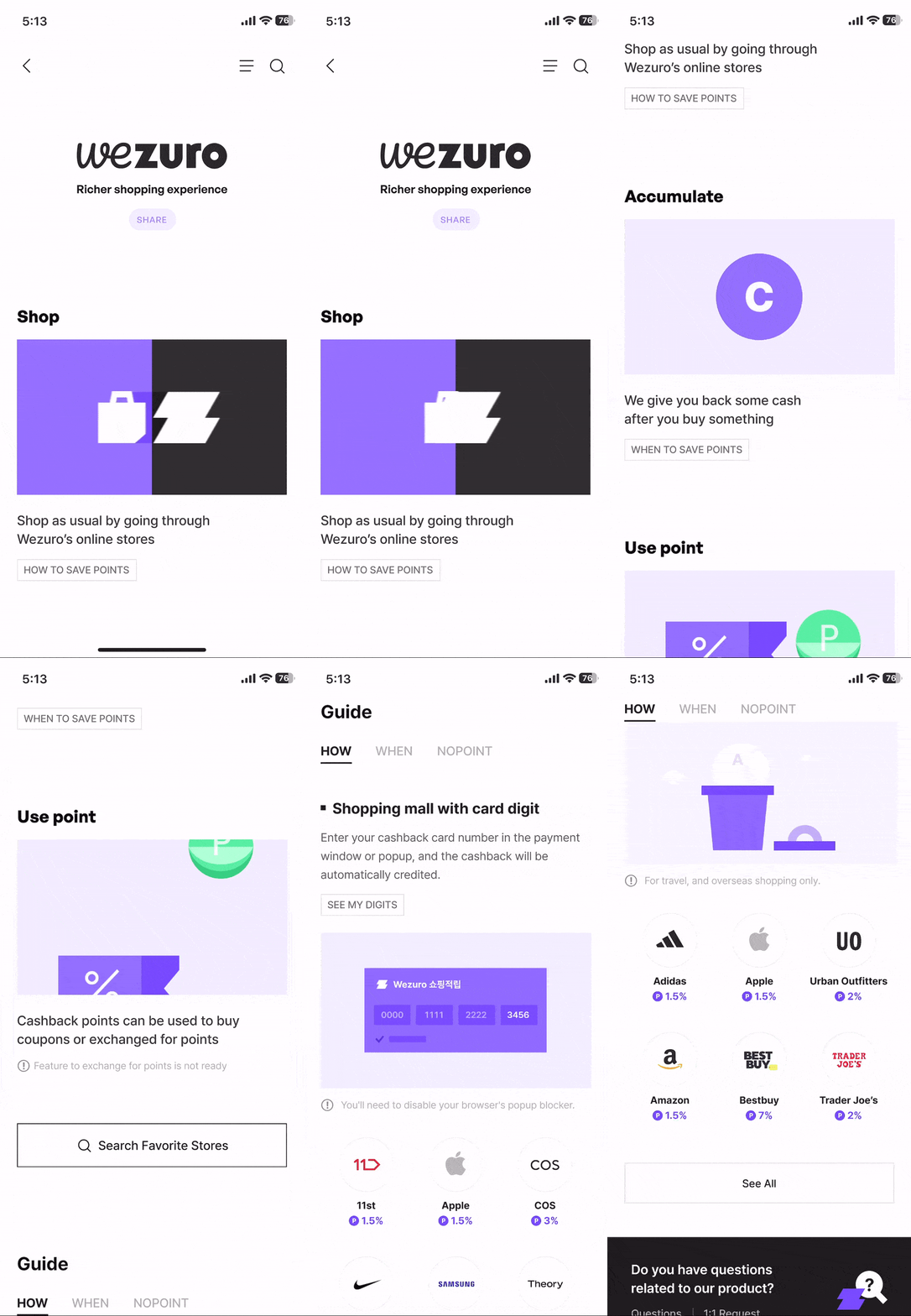
In the information feature, I designed animated graphics exclusively to enhance user understanding.
Designed with After Effects and converted with
Lottie to communicate well with developers.
Intro page
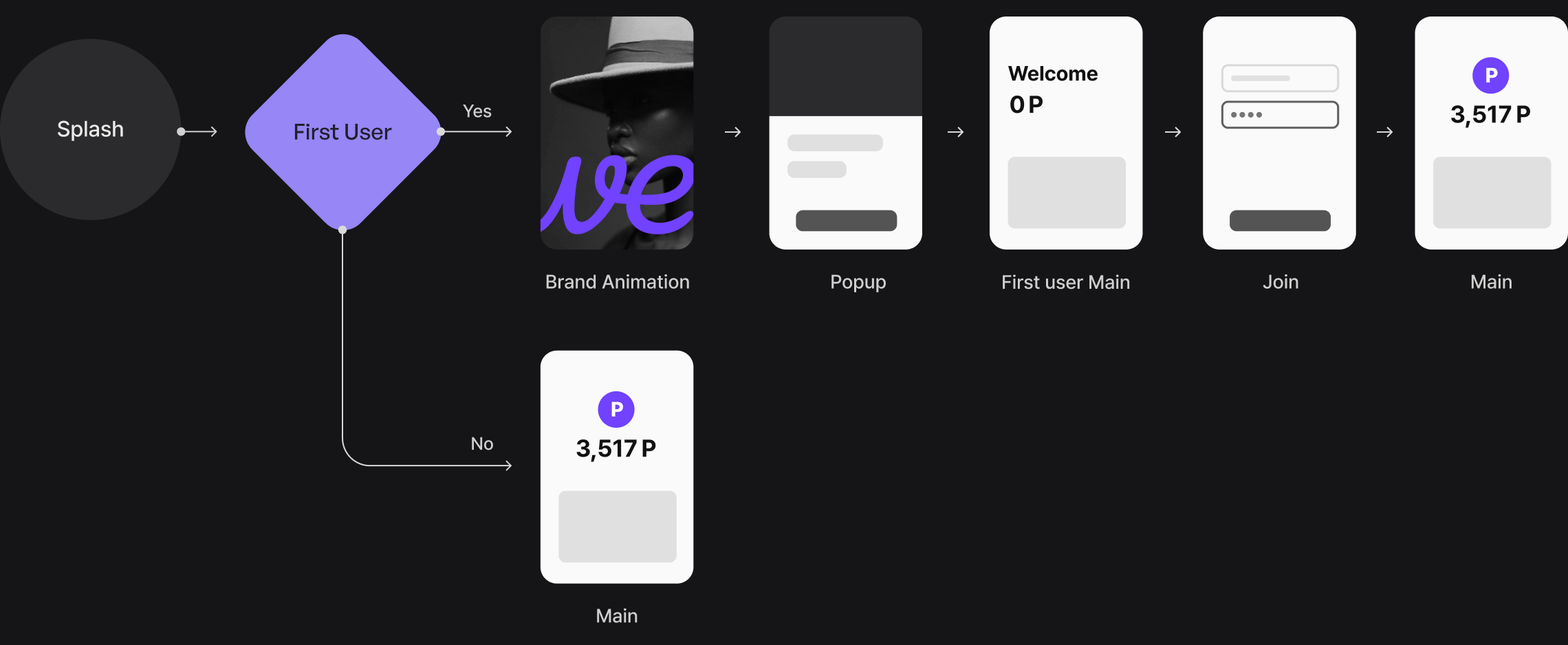
I simplified the main entry flow by branching it based on user types, reducing its depths. I also created animated interaction that emphasized Wezuro's overall branding unifying the style of  intro page for a seamless user entry to the main page.
Takeaways
To achieve end-to-end product design
iteration and communication are the key
Involving nearly 20 people from various departments, including the development team, and aiming to develop a product in just six months meant many had opinions to share. To gain consensus, it was essential to persuade through design. Ultimately, our design team successfully launched with a unique branding, leading to our selection as a top project in the 2023 UX division.
Design system makes the process faster
and reduces resource wastage
Working on a design system with three designers was first for us. By unifying and naming the UI components for our large-scale product, we enhanced usability and overall quality. This system also greatly reduced the time needed for design modifications and additions, making communication with front-end developers much easier. As a designer, managing the entire system, I realized its potential to not only streamline future design work but also increase efficiency in development.
Structure : Main
IA
By reviewing all pages, Information Architecture was modified
I reduced the flow stages during the rebranding process through consultation with the planner. I significantly modified the "My app" menu. In the past, users could set complex functions with a long scroll on the screen. However, by changing the functions to layered pop-ups, we simplified the area so that many parts could be modified without having to scroll down much.
Design
1. Based on overall usability,
create consistent but light design with consistent visual style
2.  Flexible response to future version management and updates
Color
Originally, the main colors of the T ID brand were black and red. In 2022, the brand was transitioning the main color to blue due to concerns of overlap with warning colors and for style coherence. So, when I was tasked with changing the branding of the 'T ID Developers Center,' the colors were mixed, primarily consisting of black, turquoise blue, and mustard. In particular, the blue color seemed somewhat heavy, as it was frequently applied to buttons or top bars. The main task with this rebranding was to unify into one primary color.

As the design progressed, the visual weight of the color was drastically reduced by designating blue as the primary color and setting the rest to white or translucent light gray, allowing users to focus on the contents of the Developers Center. The primary blue color was chosen to project a neutral style, and I also introduced a more subdued blue, ensuring visibility while being easy on the eyes across large areas. The mustard color was retained but limited to smaller areas for variety.
Typography
Firstly, I unified the English version font into the Roboto family. To match the Korean font to Roboto, I adjusted the spacing of Noto Sans KR, which was way farther than the English font. Due to the nature of a developer center, English and Korean were often mixed. I matched the Line height to not to look heterogeneous. Reduce the alienation of other pages by specifying the font and color set used in the compartment that shows the developer code for Android / iOS / Web.
Flexible pop-up
I changed the pop-up style to a lighter theme than before. The pop-ups have an Auto Layout function that allows designers to move flexibly in any content and is systemized to respond to multiple pop-ups.
Breadcrump, Tab styles
By changing the site plan(IA) from 3 depths to 2 depths, the design style of breadcrump and tab styles had to be changed. I got rid of dark colors from the old version, set lighter version of tab/breadcrump style that users can easily navigate their current page.
Layout
In order to maintain the responsive design, I designed the layout with three different sizes based on width. Due to the nature of the developer center,
I thought it would be less likely to work on mobile, so I set a standard suitable for web and tab sizes rather than mobile.
User needs
After defining the target users, I set main user needs based on their pain points.